Posts

Showing posts from February, 2020

Toyota Supra and BMW Z4
Image
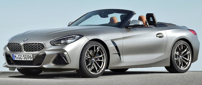
From time to time cars from different makers share the same motors or even platforms.  An interesting recent example is the BMW G29 Z4  sports car platform that the company shared with the Toyota Supra J29/DB . Even though both cars share many mechanical features, their styling is distinctly different.  And not just because the BMW is a convertible and the Toyota is a coupé.  One reason why this was possible is that both firms are in good financial shape and their need for low-cost "badge engineering" styling was nil. Below are some factory publicity images for comparison.  Each Z4 image is followed by one of a Supra. Gallery The only shared details from this viewpoint are the windshield, the round wheel openings, and the after part of the hood cutline. Even the door cutlines differ to some degree. About the only similarity seen here is the side sculpting upsweep theme -- but not any details.

Volkswagen Design Language Circa 2019

Image
Unlike some Japanese carmakers, Volkswagen has kept its styling restrained, not flamboyant. The problem all automobile firms face is the need to test body shapes in wind tunnels as part of efforts to achieve good fuel efficiency.  This results in little difference in basic shapes within each type (sedan, station wagon, SUV, etc.).  Therefore, to provide distinctive visual brand identity, cars nowadays often feature elaborate sheet metal sculpting along with cluttered, oddly-shaped details and ornamentation. Volkswagen's current design philosophy seems to take a contrarian position.  Sculpting tends to be simple and grilles and other details tend to have a horizontal theme as opposed to the curves and angles seen in many places elsewhere. 2017 Honda Civic Hatchback An example is the Honda Civic shown above. Below is a gallery of recent Volkswagen models.  The company haas been making a major effort to have a small number of platforms as the basis for a large number of models for it

Studebaker's New 1939 Champion Model

Image
The Studebaker Champion featured in the advertisement above debuted for the 1939 model year.   Its Wikipedia entry is here , and mentions that styling was done under the supervision of Raymond Loewy. The Champion was designed with the goal of being a light-weight car in the main American entry-level marketplace.  Here are some statistical comparisons.  Its wheelbase was 110 inches (2794 mm), whereas Chevrolets and Fords had wheelbases of around 112 inches (2845 mm), and Plymouth wheelbases were longer yet by about the same margin. A four-door Champion weighed about 2300 pounds (1035 kg), while Ford, Plymouth and Chevy four-doors weighed in the neighborhood of 2850 pounds (1282 kg).  Champion motors had the least horsepower (78) while the others were Chevrolet (85), Plymouth (82 or 86), and Ford (60 or 80, 80 being the norm).  Ratios of pounds per horsepower are: Champion (29.5), Chevrolet (32.9), Plymouth 86 (33.7). The Willys Overland, in the next smaller size class, had 2300/48 = 47

Ferrari Roma

Image
The above photo is amazing.  Not because of the car so much as because we see Rome's Spanish Steps utterly deserted -- something I thought was was impossible.  I'm sure the Rome police and perhaps even the Carabinieri were in cahoots with Ferrari publicists to pull off this miracle. As for the car, it's Ferrari's new Roma coupé that will be available Summer 2020.  Ferrari's website announcement is here , and a car magazine's reaction is here . For reasons not at all rational, I'm not a Ferrari fan: never was one.  But the Ferraris I like best are the custom-bodied ones of the late 1940s and the 1950s.  Which is why I am pleased to see the Roma.  It strikes me as being a reasonable 2020 version of, say, a 1953 Ferrari by Touring, Vignale or Ghia Gallery This front view shows the classic egg-crate grille bar pattern, a nice touch.  The running lights slashed across the headlight assemblies is another very nice detail -- all too often in recent years on other b

Nissan Altima Side-View Evolution 2002-2019

Image
Nissan's Altima model was enlarged for the 2002 model year to become a "standard" size car in terms of the North American market, and has maintained essentially similar wheelbases (1.9 inches, 4.9 cm variation) over three later redesigns. Although he retired from Nissan's California styling center in 2000 before all details were finalized, the design theme was developed under the direction of Jerry Hirshberg (1940-2019).   He later appeared in television advertisements discussing the new styling. As might be expected, over time original theme features fade somewhat.  Yet they are still present in modified form.  Side views are presented blow. Gallery Hirshberg's original 2002 Altima design.  Salient features are the dogleg C-pillar, the wide, flat brows over the wheel openings, and the side character line crease that rises towards the rear. A 2007-vintage Altima.  According to the link above, it used a different platform.  Yet the body has every appearance of a

1948 Hudson Convertible

Image
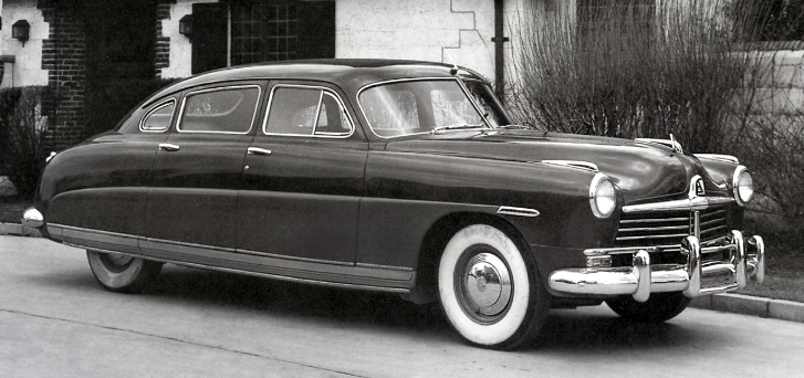
In its day, the redesigned, postwar 1948 Hudson  looked sensational.  It had the streamlined kind of appearance that "cars of the future" in advertisements and hobbyist magazine covers featured from time to time during the late 1930s and the war years.  It was low and sleek. The new Hudsons featured an essentially unitized body whose lower side frame cradled passenger compartment seating.  Advertising stressed that the new Hudsons had "step down" entry.  Well, it would be "step down" if one first stepped on the high door sill atop that side frame and made a second step down to the flooring.  For many folks it was really a "step over" if a door sill step was omitted.  Nevertheless, Hudsons were low cars for their time. There was even a convertible version available.  But here was something odd about it, as will be shown in the images below. Gallery 1948 Hudson Commodore Six sedan. 1948 Hudson Convertible Brougham.  Note the small roof sheet metal

Oldsmobile Designs from 1940 to Its '48 C-Body Redesign

Image
General Motors' Oldsmobile Division from the early 1930s to the end of the century held the middle position in the corporation's brand hierarchy: Chevrolet, Pontiac, Oldsmobile, Buick and Cadillac (the LaSalle that ended production in 1940 was a companion brand to Cadillac). And Oldsmobile had its own hierarchy of models.  During the period dealt with here, these were the 60 Series, the 70 Series and the 90 Series.  Those actual numbers were in use for the 1940 model year, but for 1941 and later the numbers were modified in the second digit place by a number indicating the number of cylinders of the motor used.  For example, a 66 Series Olds was an entry-level model with a six-cylinder engine.  In those days GM had three basic body types: A, B and C.  For various years Oldsmobiles were built using at least two of those, and sometimes all three, as was the case for most of the 1940-48 period. For some background, here are Wikipedia links dealing with types A , B and C .  Serie

Peugeot Streamliner: 1936 Andreau

Image
Maybe it's just me, but I think many of the 1920s and 1930s experimental and production cars whose shapes were base on wind tunnel testing are rather ugly.  That might well be due to the engineering requirements and passenger compartment layouts of the time that tended to dictate awkward proportions for those streamlined bodies. Something of an exception was the Peugeot "Andreau" -- named after the aerodynamicist -- revealed at the October 1936 Salon de l'Automobile in Paris. Some background regarding it along with photos of a surviving example can be found  here , and another treatment is here . The Andreau was designed around the standard Peugeot 402 production sedan that already featured a sleek, streamlined appearance for its time (the 402 was introduced at the 1935 Salon).  Therefore, the proportions problem suggested above was largely avoided.  Theoretically the Peugeot-sponsored design might have become a production car due to its 402 basis. I rather like the