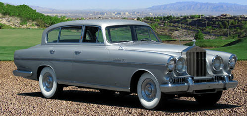
What Were They Thinking? Michelotti's Vignale Rolls Royce
The cited car was a 1954 Roll-Royce Silver Wraith with a custom body by Italian coachbuilder Vignale completed in 1955. The designer was the well-known Giovanni Michelotti who later designed production car bodies for Triumph.
Being a custom bodied automobile, its design features were influenced by Vignale's client. Some of this is mentioned here on the Bonhams auction web site in reference to its 2014 offering at Quail Lodge in California. What might be important is that he was an American. Which suggests that he wanted the car to have 1954-vintage American styling features.
The car was on display for a while at the Blackhawk museum in California's Bay Area. That is the source of this and similar images below. The "ugly" bit is the front end design that features the then-standard Rolls grille along with 1954-vintage styling features such as "Frenched" headlight assemblies and flow-through fenders.
Here is a Michelotti proposal drawing of the car.
This side view shows that the actual car was longer than as depicted by Michelotti. Though it needs mentioning that his drawings were not always true to form, as I posted here.
Aside from the front end, the most distinguishing feature was the reverse-slanted backlight window.
The 1953 Packard Balboa concept car's back window design might have influenced Vignale's client, but I can't rule out the possibility that it was Michelotti himself who was influenced by the Balboa.
A view of the rear end, unknown source. The styling seems far more American than Italian.
Front view via Bonhams. All the headlight assemblies are fussy, adding to an already cluttered composition. The grille-flanking openings add to this because of the wide spacing of their vertical bars that contrast with the Rolls-Royce grille bar spacing. Michelotti should have used the latter's spacing on the flank openings.
I think this might be the most attractive view of the design (Bonhams photo). Very 1954 American (but no garish two-tone paint scheme).


Comments
Post a Comment